How high is your churn rate, and what are you doing to reduce it? Low user retention can come down to several issues – but one way to prevent it for sure is to optimise user onboarding.
At Omniplex Guide we believe successful product tours should show new and existing users how great your SaaS is, no matter how long they’ve been with you.
In this article, we will explain six easy ways to show users around your SaaS app and how each one can encourage business growth.
User Onboarding Is A Constant Process
First of all, why should you be making sure to show both new and existing users around your SaaS? Retaining users is one of the most vital factors in SaaS growth, especially considering it can be up to 9x cheaper than acquiring new customers.
To reduce churn, you need to keep users engaged and aware of the value of your product. Seeing user onboarding as a never-ending process of improving a user’s experience of your product is an essential part of this.
Why Is It Important?
Making ongoing user onboarding a priority has numerous benefits:
- Increase conversion rates:
You may well have heard of the “aha” or “wow” moment.” This moment, when a new user realises the value of your SaaS after using a key feature, is pivotal in them converting to paying customers. Demonstrating how great your product is and teaching the user how to use it is key to conversion.
- Increase retention:
Selling your product is not enough to grow your business: you need to keep your users hooked. A 5% increase in retention can boost your profits by 25% to 95%. It’s a no-brainer.
- Improve product adoption:
You may have managed to sell your product, but is your customer actually using it? Continuous onboarding to show users the value of your SaaS is essential to improve product adoption. If they understand how to use your software and can see the positive impact it has on their life, they’ll continue to use it.
- Encourage upsells and cross-sells:
The more your customer sees the value of your SaaS, the more likely they are to believe in your other products too. By constantly onboarding existing users, you can make them aware of your additional features and encourage upsells and cross-sells, thereby increasing your revenue.
- Decrease support tickets:
Properly onboarding your users allows them to confidently use your service without any extra need to contact you. It means you’ll have a better response rate for those support tickets that do need a personalised answer, giving better customer service. And your agents will be able to handle more support tickets.
6 Easy Ways To Introduce Users Around Your Saas App
#1. Interactive onboarding tours and walkthroughs
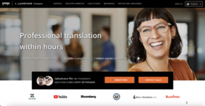
Interactive onboarding is one of the best ways to show users around your SaaS. For example, global translation services platform Gengo wanted a way to show new translators how to use their software. So Omniplex Guide created a series of step-by-step guides, localised in multiple languages, to do just that:
- Engaging virtual tours teach new users how to make the most of the platform and demonstrate the long-term value of their services.
- The interactive guides have massively improved product adoption and user retention: the percentage of new translators who become active within the first 12 weeks after signup has jumped from around 38% to Gengo’s goal of 60%.
- Gengo is now looking into new ways to use Omniplex Guide’s interactive guides across their business, such as onboarding clients.
#2. Send marketing emails
Sending marketing emails and using landing pages is another great way to continuously onboard your users. One company that really knows its way around an email marketing campaign is Canva. The online graphic design platform uses email marketing to update users on new features and offers lead magnets:
- Keep the number of emails you send to a minimum is important – you don’t want to annoy your users! Canva sends four per month.
- Your email content should be engaging and mobile optimised. Canva’s eye-catching design, concise copy, and visible CTA button cleverly avoid the “hard sell” instead of encouraging users to “Discover more.”
- Offer a lead magnet – incentivise users to try out your additional features with free trials or discount codes, like Canva has done here to encourage product adoption and upselling.
- Personalise your landing pages! Marketing emails should link to landing pages tailored to the target audience for the feature you want to sell. In fact, search-optimised landing pages allow Canva to reach millions of people looking for graphic design templates via Google Search.
#3. Announcement bars
Announcement bars – AKA hello bars or banner bars – sit at the top or bottom of your user’s browser screen.
Successful announcement bars capture the user’s attention without intruding on their browsing experience. The CTA button is highly visible, so users can’t miss it – but the bar remains much less intrusive than annoying pop-ups.
We use bars for a variety of different onboarding purposes:
- Welcome visitors with a personalised message
- Offer a lead magnet to encourage upsells and cross-sells
- Suggest additional features. As in the example above, short, simple messaging should create curiosity, so users would want to find out if this “awesome feature” could benefit them.
#4. In-app notifications
In-app notifications have been proven to boost user retention by as much as three times. With personalised, engaging copy like the below examples from Grammarly, in-app messaging can enhance your user’s experience and make them aware of additional features:
The most crucial factor in creating effective in-app notifications is ensuring they’re tailored to the user and where they are in the onboarding process:
- Suggest the user streamline their experience by installing the desktop/browser app depending on the hardware and software they’re using like Grammarly has done here.
- Target dissatisfied users on a cancelation page to change their minds before they cancel. Use targeted messaging to increase conversions by appealing to user interests.
- Encourage satisfied users to recommend a potential new customer.
- Give users at the end of a free trial a reminder to upgrade.
Larger than the hello bars we analysed above, in-app messaging allows for longer copy to give users more information. The CTA buttons are highly visible, but overall the notification does not negatively impact the user experience. Overall, targeted in-app notifications are an easy way to enhance your users’ experience of your SaaS and combat any issues they might have.
#5. How-to Videos (and other forms of helpful branded content)
A very popular way for businesses to show users around their SaaS is through video tutorials. Look at online graphic design platform Webflow’s Academy on YouTube, for example. They have huge amounts of helpful branded content broken down into specific how-tos.
Explaining how to use your software shows its value to your users, giving them that aha! moment we mentioned above. To create successful onboarding video tutorials:
- Provide helpful information your users can refer back to instead of contacting you when they have a question, decreasing support tickets.
- Understand what users want to know and target your content accordingly. Otherwise, users can get overwhelmed and quickly give up searching for their answers.
- Package and repackage your tutorials into easily consumed sections – like Webflow’s #21dayportfolio course – to keep content fresh and relevant. This encourages new and existing users to learn new skills and discover new ways to take advantage of your services.
#6. Sign-in page
One last easy way to keep onboarding your users is to announce new features on your sign-in page. Like in-app notifications and hello bars, this is a great way to demonstrate added value to users when they’re already thinking about you:
The new product announcement on Drift’s sign-in page is a successful onboarding tool because it:
- Quickly catches the user’s eye. Bright colours, engaging copy, and a highly visible CTA button stand out from the neutral sign-in feature that users came to the page for.
- Creates curiosity: the copy is clear and concise, briefly explaining the value of Drift’s new platform and inviting users to attend a webinar to learn more about it.
- Directs users to discover more information: CTA button links to a landing page to read more and sign up for the webinar.
Make Sure Users Always Know Your Most Valuable Features
As we’ve learned in this article, one of the best ways to maintain high user retention is through constantly onboarding users — old and new. Demonstrating the value of your software throughout your user’s journey, making users aware of new features, and anticipating their needs for support is a sure-fire way to grow your SaaS.
There are several different easy ways you can show users around your SaaS. At Omniplex Guide, we create a combination of personalised tools that target users at various stages of their journey with you. In doing so, our onboarding tools increase conversion, retention, and product adoption, encourage upsells, and decrease support tickets. What’s not to love about that?
